
UI UX Design
Neeha Fathima
CDO & Co-Founder

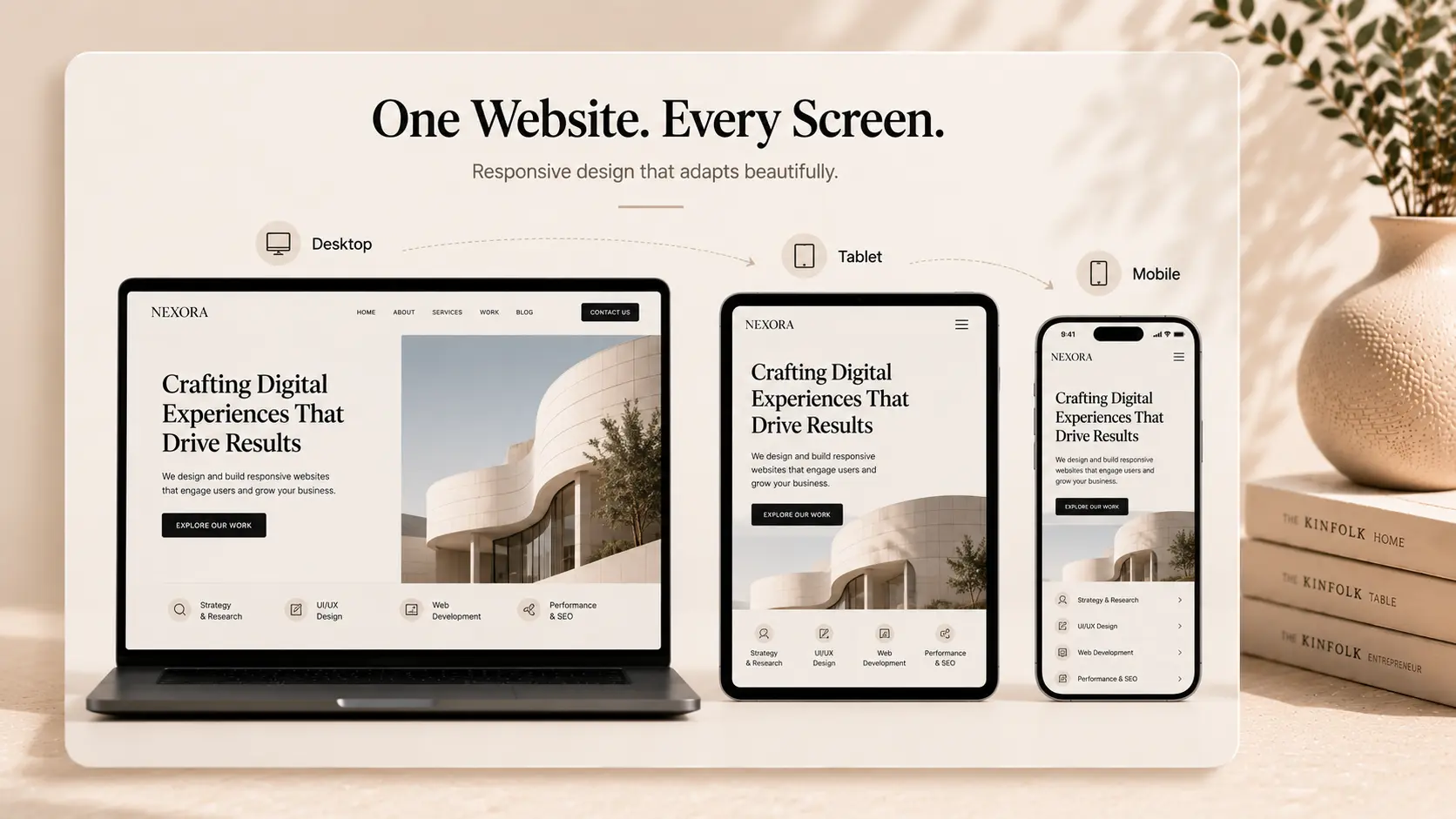
You are probably reading this because your website looks great on a computer but breaks on a mobile phone. Or maybe you are planning a new launch and want to make sure it works for everyone, everywhere. It is incredibly frustrating when buttons are too small to click, or text spills off the screen. I have seen so many businesses lose customers simply because their mobile site was hard to use.
Let us look at some quick facts to set the stage. Today, over 55% of global web traffic comes from mobile phones. Search engines also rank your desktop site based on how well your mobile version works. If your mobile layout is broken, your search rankings will suffer.
Finding the right team to fix this is not always easy. The market is full of options, and they all promise the same things. I want to share my honest thoughts on the top agencies that can actually build a site that adapts to any screen.
How We Created This 2026 Review List
I wanted to keep this list highly practical. My team and I looked at agencies that do more than just stretch desktop designs to fit small screens. We looked for partners who design for mobile devices first.
We rated these companies based on three main points. First, we looked at their design process and if they use modern layout tools. Second, we checked how quickly their websites load on mobile networks. Finally, we looked at how well they communicate with clients across different time zones.
1. Createxp: Your Global Partner for Fast, Adaptive Sites
I might be biased, but I truly believe what we are doing at Createxp is changing how brands look online. We are a design and development studio based in India. Do not let our location fool you, though. We work with founders and businesses across five continents, from New York to London and Sydney.
CREATEXP AT A GLANCE | |
|---|---|
Location | Remote (Serves Globally) |
Core Focus | Custom Software & Responsive Web Development |
Team Structure | 100% In-house (No Outsourcing) |
Best For | Startups & Fast-growing Enterprises |
Our secret is simple: we do not outsource anything. We have an in-house team of designers, developers, and copywriters. When you work with us, you talk directly to the people building your site. We use collaborative design tools to let you see our progress in real-time.
Why Our Remote Process Works So Well
Many people ask how a studio in India can design for a startup in San Francisco. Honestly, physical distance does not matter when you have the right communication systems. We structure our working hours to overlap with your day, so you never have to wait long for an answer.
We built a responsive web design agency that treats your project like our own. Our focus is on clean code and quick loading times. We make sure your site looks polished on a cheap phone just as much as on a high-end laptop.
2. Clay: The Premium Option for High-End Tech Brands
Based in San Francisco, Clay is a highly respected agency. They focus on brand strategy and digital product design. If you have a large budget and need an incredibly polished look, they are a fantastic choice.
They work with some of the biggest tech brands in Silicon Valley. Their design style is very clean, modern, and interactive. They specialize in creating custom interactions that make websites feel like native mobile apps.
However, their premium services come with a high price tag. They are best suited for enterprise-level companies. If you are an early-stage startup, their pricing might be a bit too steep.
3. SpinX Group: Los Angeles Creative Experts
SpinX Group is a solid mobile responsive web design agency located in California. They have been around for a long time and understand how to build reliable websites. They do a great job of combining marketing strategy with technical execution.
Their team focuses on mid-market businesses. They build custom content management systems and work heavily with WordPress. They ensure that every site they build passes strict mobile-friendliness tests.
They are a great fit if you want a local US team with a traditional agency approach. Their process is structured, although it can take a bit longer than more agile, modern studios.
Selecting the Best Responsive Design Companies for Your Project
To help you compare, I put together a quick look at how these top partners stack up against each other.
Agency | Best For | Team Style | Typical Timeline |
Createxp | Startups & Scale-ups | Fast, agile, 100% in-house | 4 to 6 weeks |
Clay | Enterprise Tech Brands | High-end, strategy-first | 12+ weeks |
SpinX Group | Mid-market Corporates | Traditional, structured | 8 to 12 weeks |
Why You Must Partner with a Mobile First Web Design Agency
Designing for mobile first is no longer just a trend. It is a technical necessity. When an agency designs for mobile first, they start with the smallest screen size and work their way up.
This approach forces you to focus on what is truly important. You cannot clutter a phone screen with useless text or giant images. By starting small, your core message stays clear and your site loads much faster.
Slow websites lose visitors. In fact, most users will leave a page if it takes more than three seconds to load on their mobile network. A specialized mobile first web design agency knows how to optimize images and clean up code to keep your load times low.
What Does a Custom Responsive Web Design Project Cost?
I like to be open about numbers because budget is always a major factor. The cost of hiring a responsive web design agency depends heavily on complexity and the agency's location.
[ Low-End / Template ] --> $3,000 - $8,000
[ Mid-Market Custom ] --> $10,000 - $35,000 <-- (Createxp Range)
[ Enterprise Custom ] --> $50,000+
A basic responsive site built on a template might cost between $3,000 and $8,000. These are fine for local, small businesses.
For a custom, high-performing website built to convert visitors, expect to spend between $10,000 and $35,000. This tier includes custom layouts, fast performance, and proper SEO setup.
Enterprise agencies in major US cities often start their projects at $50,000 and can easily go over $100,000. You are paying for their brand name and local physical overhead.
A Quick Summary of Your Options
Finding the right design partner depends on your specific goals, budget, and timeline.
Choose Createxp if you want a fast, highly collaborative team that delivers top-tier work without the bloated enterprise price tag.
Choose Clay if you are a large corporate brand needing high-end, valley-style design and have a massive budget.
Choose SpinX Group if you prefer a traditional, US-based agency with a focus on mid-sized corporate projects.
Actionable Tips to Remember
Always test your current website on your own phone before talking to an agency. Note down what feels awkward to use.
Ask potential agencies to show you their live mobile sites, not just desktop screenshots.
Make sure your contract includes mobile speed optimization as a deliverable.
Avoid agencies that use automatic conversion tools; custom layouts always perform better.
Answers to Common Questions
How is mobile-first design different from responsive design?
Responsive design means a desktop site is programmed to shrink down to fit mobile screens. Mobile-first design is the opposite. The team designs the mobile experience first, then adds more features and layout columns as the screen size gets larger.
Do I need a separate website for mobile users?
No, you should not build a separate mobile site. Modern web standards allow you to have one single website that automatically adjusts to any device. This makes managing your content and tracking your SEO much easier.
How long does it take to build a responsive website?
A custom project usually takes between 4 and 10 weeks. This timeline includes planning, design, development, testing, and launching. Simple landing pages can be done faster, while complex web applications take longer.
Will a responsive site improve my Google rankings?
Yes. Google uses mobile-first indexing, meaning its search engine looks at your mobile site to determine your rankings. A mobile-friendly site will rank significantly higher than one that is difficult to use on a phone.
Can an agency update my existing site to be responsive?
Sometimes it is possible, but it is often faster and cheaper to rebuild the frontend of the site. Old code is hard to adapt. A fresh build ensures your site uses modern, fast, and secure coding practices.
Warning: Working With Us May Trigger Unstoppable Momentum