
UI UX Design
Neeha Fathima
CDO & Co-Founder
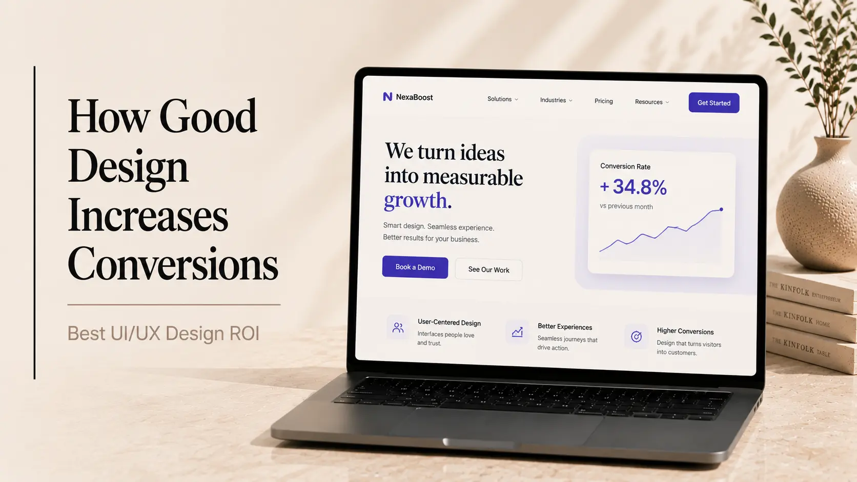
Someone on your team just asked whether the design investment is actually worth it. Maybe it was your CFO, maybe it was you. Either way, it's a completely reasonable question. Design can feel abstract when you're trying to justify budget against engineering, marketing, or sales headcount.
But here's the thing, design has some of the most measurable ROI in a business. More measurable than most founders realise. Every screen a user interacts with, every form they fill out, every checkout they abandon is a data point. And the data is pretty consistent: well-executed UI/UX design directly increases conversions, retention, and revenue.
The headline number that tends to stop most budget conversations cold: Forrester Research found that every $1 invested in UX returns up to $100. That's a 9,900% return. Even at the conservative end of that estimate, the case for design investment is overwhelming. This isn't about making things look nicer, it's about making products that actually work for people, and products that work convert better.
This post breaks down the real numbers behind UI/UX design ROI, walks through specific design changes that drove measurable conversion improvements, and gives you a framework for thinking about design as a business lever rather than a cost line.
The Short Version for Anyone Who Needs It Fast
UI/UX design ROI is real, it's measurable, and it shows up fastest in three places: conversion rates, user retention, and support costs. Most businesses that invest in UX improvements see measurable results within 30 to 90 days of launch.
The exact return depends on where you start, what you fix, and how broken things were before. A company with a high-friction checkout process will see different gains from a redesign than a SaaS product with an unclear onboarding experience.
What's consistent across every context is this: bad UX costs money silently. Every user who drops off a form, abandons a cart, or gives up on onboarding is a revenue loss you don't always see until you go looking. Good design closes those gaps, and that's exactly what the data shows.
The Numbers That Make the Business Case
Before getting into specific case studies, here's the research that underpins the design-ROI relationship. These figures come from multiple credible sources and reflect real-world outcomes across different industries and product types.
UX Design ROI Benchmarks (Cross-Industry)
UX Design Area | Reported Impact | Source / Context |
Every $1 invested in UX | Returns up to $100 | Forrester Research |
Good UX design (overall) | Conversion rate up 200–400% | Forrester Research |
Page load time: 1s faster | Conversion rate up 7% | Akamai / multiple studies |
Usability improvements | Task success rate up 135% | Nielsen Norman Group |
Mobile UX optimisation | Mobile revenue up 20–30% | Google / Think with Google |
Checkout flow redesign | Cart abandonment reduced 20–35% | Baymard Institute |
Onboarding UX improvements | User activation up 40–60% | SaaS benchmark data |
Design-led companies (10yr) | Outperform S&P 500 by 211% | Design Management Institute |
A few of these deserve a closer look. The Baymard Institute has done extensive research on e-commerce UX specifically. Their data shows that 69.8% of shopping carts are abandoned on average. Improved checkout UX alone has been shown to reduce that by 20–35%, which for most e-commerce businesses represents a significant revenue recovery with no additional marketing spend.
The onboarding number is equally striking. For SaaS businesses, the trial-to-paid conversion window is often decided in the first session. If users don't quickly understand the value, they leave, and they rarely come back. Onboarding UX improvements that reduce friction and surface the core value faster consistently drive 40–60% improvements in activation rates.
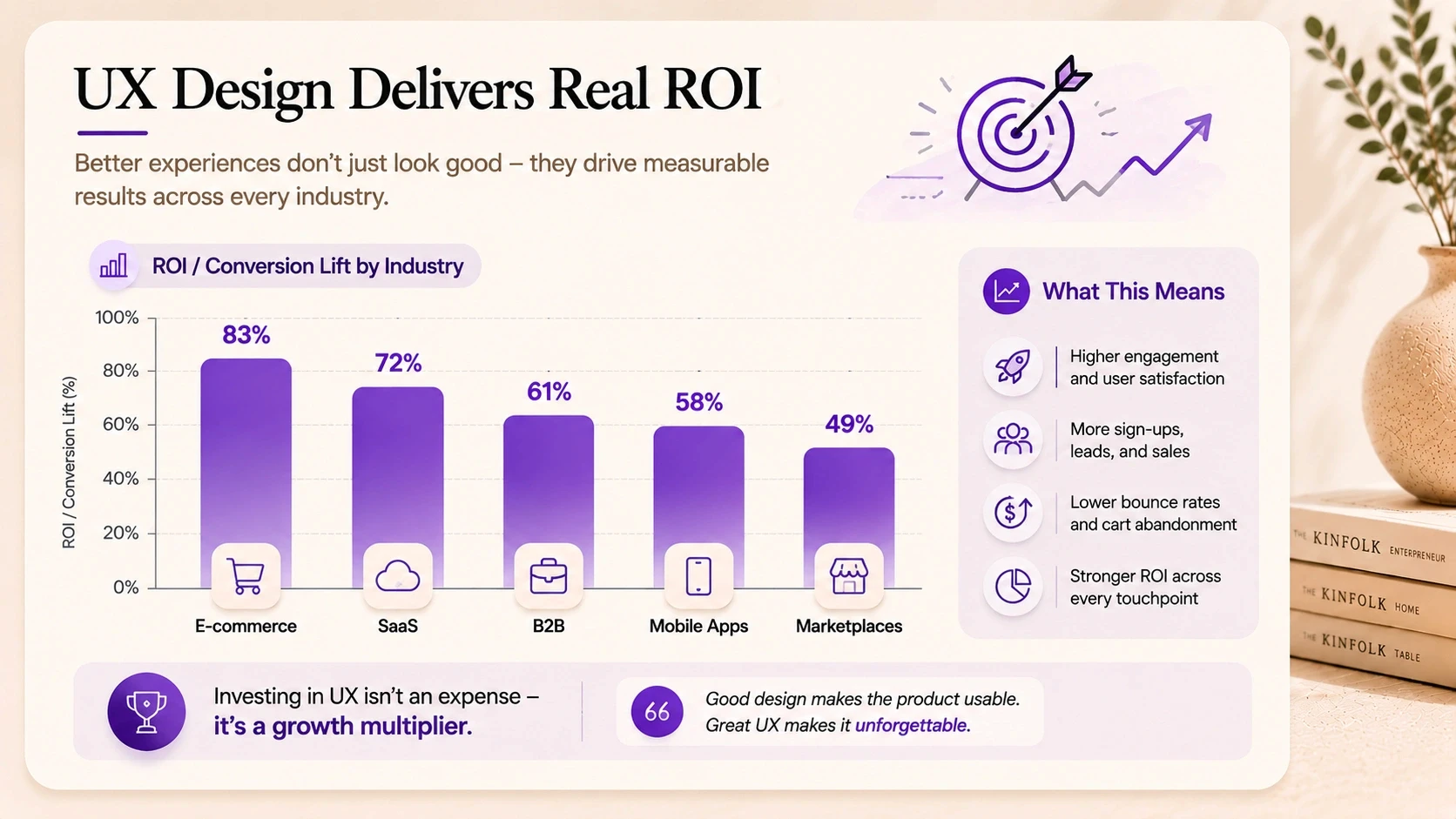
Where Design Actually Moves the Numbers
Not every design change produces the same ROI. The return on investment from UX design is highest when you focus on the moments in a user's journey where friction is costing you the most. Here's how that breaks down by business type.
Design Impact on Conversions by Business Type
Business Type | Primary UX Lever | Typical ROI Impact | Priority Area |
E-commerce / DTC | Checkout & product pages | 15–40% conversion lift | Funnel drop-off |
SaaS / software | Onboarding & activation | 30–60% retention uplift | Trial-to-paid rate |
B2B / lead gen | Landing pages & CTAs | 25–50% lead volume lift | Form completion |
Mobile apps | Core user flows | 20–45% engagement lift | DAU / session depth |
Marketplaces | Search & discovery UX | 15–35% GMV increase | Browse-to-buy rate |
Fintech / regulated | Trust signals & clarity | 20–40% onboarding lift | Drop-off at KYC |
The pattern across all of these is the same. Design ROI is highest where user intent is high but friction is stopping them from completing the action. A user who's already on your checkout page wants to buy. A trial user who just signed up wants to see value. Reducing friction at those moments doesn't require convincing anyone of anything, it just removes the obstacles that are already there.
The cost of doing nothing
It's worth naming this directly. If you're not investing in UX improvements, the cost doesn't disappear, it just sits in your metrics as lost conversions, churned users, and inflated support costs.
Poor UX is estimated to cost US businesses alone over $1.4 trillion annually in lost productivity and abandonment. That number is staggering, but it makes sense when you think about it at a micro level: every user who gives up on your product took time and money to acquire. Losing them to friction is a double loss.
Real Case Studies: Design Changes That Drove Real Results
Data and benchmarks are useful. Specific stories are more convincing. Here are six real-world examples of UX changes that produced measurable conversion and revenue improvements.
UX Design Improvements: Outcomes at a Glance
Company / Type | Design Change Made | Result | Timeframe |
E-commerce (fashion) | Checkout flow simplified from 5 steps to 2 | Cart abandonment down 31%, revenue up 24% | 6 weeks post-launch |
B2B SaaS (HR tool) | Onboarding redesigned with progress indicators | Trial-to-paid rate up 42% | 90 days post-launch |
Fintech startup | KYC form UX overhauled, trust signals added | Drop-off at verification down 38% | 30 days post-launch |
Healthcare app | Navigation restructured, key actions surfaced | Daily active users up 55% | 3 months post-launch |
Marketplace (services) | Search & filter UX redesigned | Booking completion rate up 29% | 8 weeks post-launch |
SaaS (project mgmt) | Empty state UX added, feature discovery improved | Feature adoption up 63% | 60 days post-launch |
The case studies above share a pattern worth noting. None of these were complete product overhauls. Most were targeted interventions on specific high-friction moments, a checkout flow, an onboarding sequence, a navigation structure. The ROI from UX design is often highest when you fix the right thing, not when you redesign everything at once.
Three of Those Case Studies, Up Close
The table gives you the outcomes. Here's what actually happened in three of those projects, the design thinking behind the decision, and why it worked.
Case Study 1: E-Commerce Checkout Redesign
A fashion e-commerce brand was seeing strong traffic but a checkout abandonment rate significantly above the industry average. Users were dropping off consistently at the payment step.
The UX audit identified the root cause: a five-step checkout process that asked for account creation before payment, and a form layout that felt overwhelming on mobile. Neither of these was intentional, they'd just accumulated over time as features were added.
What changed
Guest checkout was introduced as the default path
The form was restructured from five steps to two using inline validation
Trust signals, security badges, return policy, live chat, were added directly in the checkout view
Mobile layout was rebuilt from scratch rather than adapted from desktop
Result: cart abandonment dropped 31% and revenue increased 24% within six weeks of launch. The traffic didn't change. The product didn't change. Only the experience of completing the purchase changed.
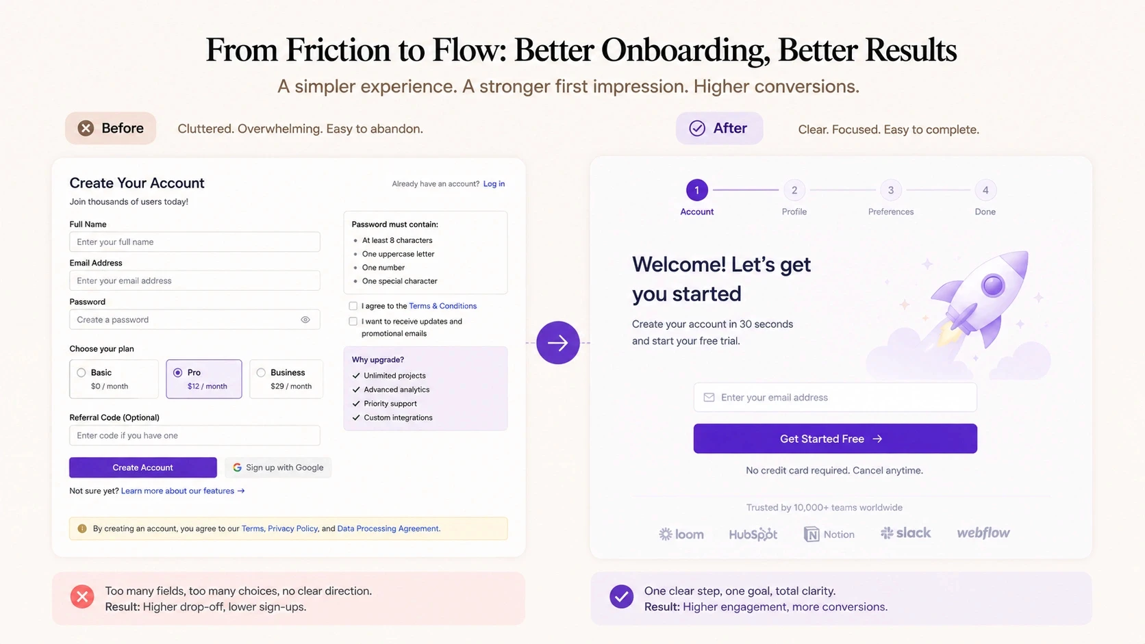
Case Study 2: SaaS Onboarding Redesign
A B2B SaaS company in the HR space had a healthy trial sign-up rate but a poor trial-to-paid conversion. Most users signed up, poked around for a day or two, and then never came back.
The UX research found that users couldn't identify the product's core value in their first session. The interface was feature-heavy, the empty state showed nothing useful, and there was no guided path to a first meaningful outcome.
What changed
An interactive onboarding sequence was designed that walked users through a first meaningful action within ten minutes
Empty states were replaced with contextual prompts that showed what the product could look like with real data
Progress indicators were added so users could see how close they were to a complete setup
Email triggers were added at day 1, 3, and 7 based on activation state
Result: trial-to-paid conversion rate increased 42% within 90 days. The product team had previously attributed the low conversion to pricing. The design research showed it was a value perception problem, users didn't understand what they were buying until the friction of the first session was removed.
Case Study 3: Fintech Verification Flow
A fintech startup was losing nearly 40% of users during KYC verification, the identity checking step required before accounts could be activated. Users were starting the process and abandoning it.
The UX audit revealed three issues: the process felt unexpectedly long, there was no progress visibility, and the language around document submission felt bureaucratic and untrustworthy.
What changed
A progress bar was added showing exact steps remaining
Microcopy throughout the flow was rewritten to be clearer and less formal
Trust signals, encryption notices, GDPR compliance badges, support contact, were added at friction points
Document upload UX was redesigned to support mobile cameras natively
Result: drop-off at verification fell 38% within 30 days. The regulatory requirements didn't change. The trust and clarity of the experience did, and that was enough.
How to Actually Measure UX Design ROI in Your Business
One reason companies underinvest in design is that they don't know how to measure what they're getting from it. Here's a simple framework.
Step 1: Define the conversion event you're optimising for
Pick one specific action: a checkout completion, a trial activation, a form submission, a key feature adoption. Don't try to measure everything at once. Focus on the moment where improving UX will have the highest business impact.
Step 2: Establish a baseline before any design work starts
What is your current conversion rate for that event? What is the drop-off rate at each step leading to it? You can't calculate ROI without a before number.
Step 3: Run UX research to identify the friction points
Session recordings (Hotjar, FullStory) to see where users struggle
Heatmaps to identify where attention goes and where it doesn't
User interviews or usability tests to understand the why behind the drop-off
Funnel analytics to quantify drop-off at each specific step
Step 4: Design targeted interventions, not full redesigns
The highest ROI design work is surgical, not wholesale. Fix the specific friction points you identified. Redesigning everything at once makes it hard to attribute what drove the improvement.
Step 5: Measure outcomes 30, 60, and 90 days post-launch
Give the changes time to accumulate data before drawing conclusions. Track both the primary conversion metric and secondary signals, support tickets, session depth, time-to-value.
How CREATEXP Connects Design Decisions to Business Outcomes
The design work CREATEXP does for startups and enterprises doesn't start with colour palettes or typography. It starts with a conversation about what the business is trying to achieve, and where the current product or website is getting in the way of that.
Every engagement involves identifying the specific friction points that matter most for the client's growth goals. For an e-commerce brand, that's usually the funnel between product discovery and purchase completion. For a SaaS product, it tends to be onboarding and feature activation. For a B2B company, it's often the landing page and lead capture flow.
The studio's approach is deliberately metrics-grounded. Before any design work starts, there's a discovery phase that maps existing conversion data, identifies the highest-leverage intervention points, and sets clear outcome targets for the engagement. The design work that follows is always anchored to those targets, not just to what looks best.
Post-launch, the team tracks outcomes actively. Not just whether the product shipped, but whether the metrics moved. That follow-through is what creates accountability in the design process, and what builds the kind of trust that turns first projects into long-term relationships.
For companies that haven't invested in UX design yet, the starting point doesn't have to be a full redesign. A focused UX audit, looking specifically at where users drop off and why, can identify the highest-ROI design interventions in two to three weeks. That kind of targeted starting point often delivers more value faster than a broader redesign that tries to fix everything at once.
Want to Know Where Your Product Is Losing Conversions? The CREATEXP team will identify your highest-ROI design opportunities, no obligation. |
The Numbers Worth Remembering
Here's the condensed version, the stats and principles you'll actually use in a budget conversation:
Every $1 invested in UX design can return up to $100 in value. That's the Forrester Research figure, and it holds across multiple studies.
Good UX design increases conversion rates by 200–400% on average. The range depends on how broken things were before.
E-commerce checkout UX improvements reduce cart abandonment by 20–35%. Nearly 70% of carts are abandoned by default, this is recoverable revenue.
SaaS onboarding redesigns consistently produce 40–60% improvements in trial-to-paid conversion rates.
Design-led companies outperform the S&P 500 by 211% over ten years. UX ROI isn't just a project metric, it's a company-level differentiator.
The highest-ROI design work is surgical. Fix the specific friction points that are costing you the most, not everything at once.
UX ROI is measurable. Define the conversion event, establish a baseline, run research, make targeted changes, and measure outcomes at 30, 60, and 90 days.
Bad UX has a cost even when you're not spending on design. Every abandoned checkout, churned trial user, and support ticket is a measurable loss.
Questions People Ask Most About Design ROI
What is the ROI of UX design?
The ROI of UX design varies by context, but the most widely cited benchmark is Forrester Research's finding that every $1 invested in UX returns up to $100 in value. In practical terms, this shows up as higher conversion rates, better user retention, lower support costs, and faster user activation. Design-led companies also show sustained stock market outperformance over time, according to the Design Management Institute.
How does good UX design increase conversions?
Good UX design increases conversions by removing friction from the path between user intent and action. When users find it easier to complete a checkout, understand an onboarding flow, or navigate a product, they complete more of those actions. The design impact on conversions is highest at moments of high intent, checkout pages, sign-up flows, and first-session activation sequences.
How long does it take to see ROI from a UX redesign?
Most businesses see measurable results from targeted UX improvements within 30 to 90 days of launch. Checkout and form optimisations tend to show results faster because the conversion cycle is short. Onboarding and retention improvements may take 60 to 90 days to fully surface in cohort data.
What UX changes have the highest return on investment?
The highest-ROI UX improvements are typically: checkout flow simplification for e-commerce, onboarding redesigns for SaaS products, landing page and CTA clarity for B2B lead generation, and mobile experience optimisation across all business types. The common thread is that these are all high-intent moments where removing friction directly converts to revenue.
How do I measure the return on investment from UI/UX design?
Start by defining the specific conversion event you're optimising, checkout completion, trial activation, form submission. Establish a baseline conversion rate before any design work starts. Run user research to identify friction points. Make targeted design interventions and measure conversion rates at 30, 60, and 90 days post-launch. Compare against the baseline and calculate the revenue impact of the conversion lift.
Is UX design worth the investment for a small business?
Yes, and often disproportionately so. Small businesses typically have less optimised user experiences than large enterprises, which means the improvement headroom is larger. A checkout redesign that lifts conversion by 25% has the same percentage impact on a $500K revenue business as a $50M one, but the cost of the design work is the same either way. The relative ROI often favours smaller businesses.
What is the cost of bad UX design?
Bad UX design costs money through lost conversions, higher user churn, elevated support costs, and lower customer lifetime value. Research estimates that poor UX costs US businesses alone over $1.4 trillion annually in lost productivity and abandonment. For individual businesses, the cost shows up most directly in cart abandonment rates, trial-to-paid conversion gaps, and high early-stage churn.
Warning: Working With Us May Trigger Unstoppable Momentum