
Product Design
Neeha Fathima
CDO & Co-Founder

You've done the hard part, compared agencies, asked the right questions, reviewed the proposal, and signed the contract. Now what? That moment right after signing is weirdly quiet. The excitement of choosing a team settles, and suddenly you realise you're not quite sure what's about to happen or what you're supposed to do next.
This is one of those questions that doesn't get asked enough, probably because founders feel like they should already know. But understanding the product design process isn't just useful for peace of mind. It directly affects how good the output turns out to be. Clients who understand each phase, know when to give input, and understand what they're reviewing get significantly better results.
The data backs this up. IBM research found that fixing a design problem in development costs 10x more than fixing it in design, and fixing it after launch costs 100x more. The product design workflow exists specifically to surface and solve problems at the cheapest stage possible. Your participation in that process, at the right moments, is what determines whether issues get caught early or late.
This post walks through every stage of a professional product design process, what happens in each phase, what you as the client need to do, and what to watch out for. Think of it as the onboarding guide you wished someone had given you on day one.
The Map Before the Journey: What a Full Process Looks Like
Before going deep on each phase, here's the full product design workflow at a glance. Most professional engagements, whether they're a website, a mobile app, or a complex SaaS product, move through the same core stages.
Product Design Process: Phase Overview
Phase | What Happens | Typical Duration | Key Outputs |
1. Kickoff & Discovery | Goals aligned, users defined, constraints mapped | Week 1 | Brief, research plan, user personas |
2. Research & Audit | User interviews, competitor review, existing data analysed | Weeks 1–2 | Research findings, opportunity map |
3. Information Architecture | Flows mapped, navigation structured, content hierarchy set | Week 2 | Site map, user flow diagrams |
4. Wireframing | Low-fidelity layouts created and reviewed | Weeks 2–3 | Wireframe deck for all key screens |
5. Visual Design (UI) | High-fidelity screens, brand applied, component system built | Weeks 3–5 | Full UI mockups, style guide |
6. Prototyping | Clickable prototype built for stakeholder review and testing | Week 5 | Figma / interactive prototype |
7. User Testing & Iteration | Real users tested, feedback gathered, design refined | Weeks 5–6 | Test report, revised screens |
8. Handoff & Documentation | Dev-ready files delivered with annotations and assets | Week 6–7 | Handoff package, component specs |
Timelines compress or expand based on project size. A focused landing page or MVP design might run four to six weeks total. A full product design engagement for a complex app might span twelve to twenty weeks. What stays consistent is the sequence, each phase builds on the last, and skipping one almost always creates problems downstream.
The single most important thing to understand about the design project timeline: decisions made in the early phases are cheap to change. Decisions made in the final phases are expensive. This is why discovery isn't a bureaucratic formality, it's where the highest-stakes design decisions actually happen.

Phase 1: The Kickoff, More Important Than Most People Realise
The kickoff session is the first real working meeting of the engagement. It's not a meet-and-greet. Done properly, it's where the entire design direction gets shaped.
A good design team uses the kickoff to align on what success looks like, not just in terms of deliverables, but in terms of business outcomes. What does the product need to achieve? Who are the users, and what do they need to accomplish? What constraints exist, technical, brand, regulatory, timeline?
What happens in a kickoff
• Goals and success metrics are defined and agreed on
• User profiles and target audience are mapped out in detail
• Existing research, analytics, and brand assets are reviewed
• Technical constraints and platform requirements are identified
• Communication cadence and feedback process are agreed on
What you should bring to kickoff
The more prepared you are, the faster the whole project moves. Come with any existing user research, analytics data, competitor examples you like or dislike, brand guidelines, and a clear articulation of who your primary user is. If you don't have all of this, the design team can help you find it, but knowing what exists upfront saves time.
One thing that often gets skipped: agreeing on who has final approval authority. Feedback from ten different stakeholders mid-project is one of the main causes of scope expansion and timeline delays. Agree on one or two decision-makers upfront, and stick to it.
Phase 2: Research, The Phase That Justifies Everything Else
This is the phase that separates design studios from decorators. Research is what makes design decisions defensible, not just aesthetically appealing.
For most product design projects, research involves two things: understanding the users, and understanding the competitive landscape. User research doesn't have to be a six-week ethnographic study. Even three to five structured user interviews surface insights that change the direction of the design in meaningful ways.
What user research in a design project looks like
30–45 minute interviews with people who represent your target user
Questions focused on current behavior, frustrations, and goals, not opinions about the design
Synthesis into key insights and opportunity areas that inform design decisions
Competitive research and UX audits
If you have an existing product, a UX audit at this stage is invaluable. It maps where users are currently dropping off, what's working, and what isn't, before any new design work starts. This prevents designing in a vacuum and anchors the new work in real user behavior.
Competitive analysis looks at how similar products solve the same problems. Not to copy them, to understand category conventions, identify gaps, and make informed choices about where to differentiate.
A good question to ask your design team at this stage: "What did the research tell you that surprised you?" If the answer is nothing, either the research wasn't deep enough or the product is already unusually well-understood.
Phase 3: Information Architecture, Building the Skeleton
Before anyone opens a design tool, the structure of the product needs to be mapped. Information architecture (IA) is exactly that, a blueprint for how content and features are organised, how users navigate between them, and what the hierarchy of the experience looks like.
This phase produces site maps and user flow diagrams. They're not glamorous. They're also the most important structural decisions of the entire project.
Why IA decisions are hard to change later
Navigation structure, content hierarchy, and user flow architecture are deeply embedded in a product. Changing them after visual design is started means redoing a significant amount of work. Changing them after development has started means even more. Getting agreement on the structure before any visual design begins is how you avoid expensive late-stage rework.
What to review at this stage
Does the navigation structure reflect how users think, or how you've internally organised things?
Is the most important action in the product easy to find from any starting point?
Does the flow match what the research said users actually need to do?
Your job as a client at this stage is to push back if the structure doesn't reflect your users' mental model. This is a low-cost moment to make structural changes. Take it seriously.
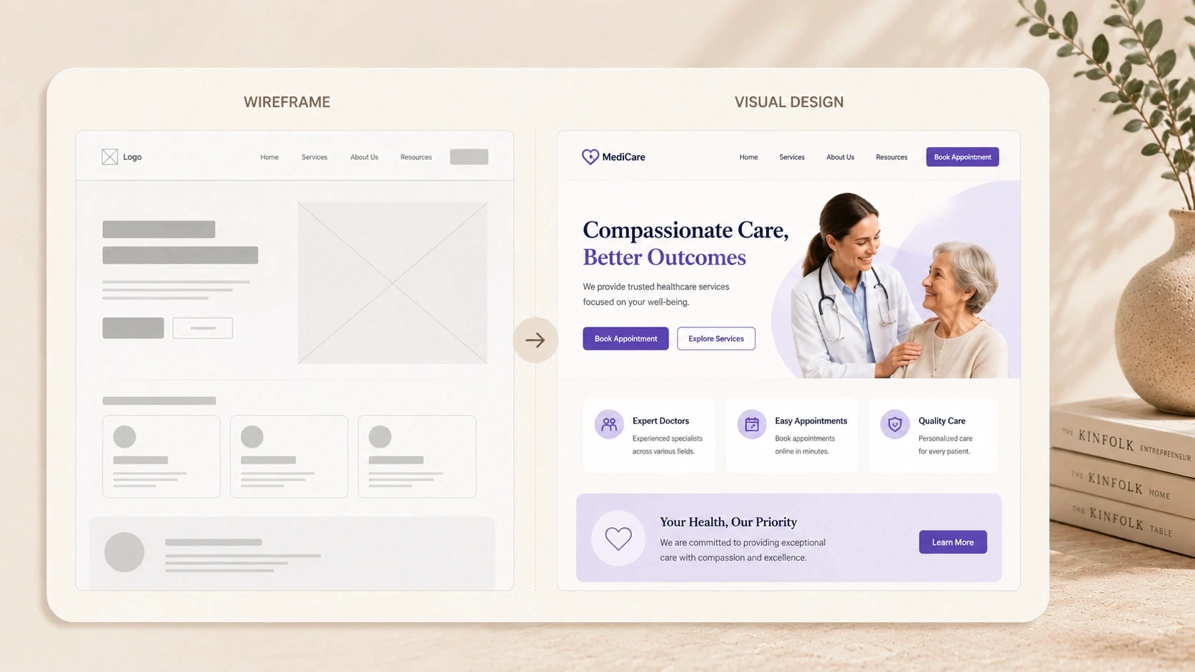
Phase 4: Wireframing, Where Ideas Become Screens
Wireframes are low-fidelity layouts that show the structure of each screen without the visual design layer. Think grey boxes, placeholder text, and rough component positions, no colours, no brand, no polish.
This is intentional. Wireframes let you evaluate the layout and logic of a screen without being distracted by aesthetics. It's much easier to say "this button is in the wrong place" when you're not also judging the colour palette.
What to look for when reviewing wireframes
Is the primary action on each screen obvious without explanation?
Does the content hierarchy match what's most important to users?
Does the flow between screens make sense?
Is anything missing that a user would expect to find here?
One of the most common client mistakes at this stage: commenting on visual design elements that haven't been applied yet. "It feels too plain" or "I'd want it to look more premium" are visual design comments, save them for the next phase. Wireframe feedback should be structural and functional.
How many wireframe rounds are normal?
Most mid-size projects include one or two rounds of wireframe review and revision. More than two usually indicates either a brief that wasn't clear enough, or feedback that's not specific enough to action. Both are worth addressing before moving to visual design.
Phase 5: Visual Design, This Is the Part Most People Picture
This is where the product starts to look like a real thing. The wireframe structure gets applied with typography, colour, imagery, iconography, and spacing. Brand guidelines come in. The component system gets built. And the product starts to feel like it belongs to your company.
High-fidelity UI design is typically the most time-intensive phase of the product design process. For a mid-size project, this stage often accounts for 30–40% of the total design hours.
What a design system is and why it matters
A design system is a library of reusable components, buttons, form fields, cards, navigation elements, modals, each designed once and used consistently across the entire product. Building this during the design phase means developers have a clear, consistent reference for every element they build.
Products without a design system accumulate inconsistencies over time. Every time a developer needs a component that hasn't been explicitly designed, they make a judgment call. Those judgment calls compound. The product starts feeling disjointed. A good design system prevents this.
Visual design review tips
Review on the device it's primarily designed for, mobile designs on a phone, not a desktop screen
Focus feedback on whether the design communicates what it needs to, not personal taste
One consolidated round of feedback is far more efficient than multiple small comments over days
Phases 6 & 7: Prototyping and Testing, The Reality Check
Once the visual design is approved, the design team builds a clickable prototype. This is a working simulation of the product, you can tap through it, follow real user flows, and experience the product the way a real user would. Without any code being written.
Prototypes are the most powerful tool for catching problems before development. Showing a prototype to three to five real users consistently surfaces issues that weeks of internal review miss. People do unexpected things. They look for things in places you didn't put them. They read copy differently than you intended.
What user testing at this stage looks like
• 3–5 sessions with people who match your target user profile
• Task-based: "please try to sign up and complete your first action"
• Observed without coaching, the design team watches, doesn't help
• Key friction points are documented and prioritised for revision
The output of testing is a revised design, not a full rework, but targeted fixes to the specific friction points that surfaced. This iteration cycle is where the product design workflow earns its value. Every issue caught here is one that won't reach development.
Phase 8: Handoff, Where Design Quality Gets Lost (If You're Not Careful)
Handoff is the moment the design team passes everything to the development team. Done well, it's clean and comprehensive. Done badly, it's a Figma file full of unlabelled layers and a developer trying to guess spacing values.
A professional design handoff includes more than files. It includes documentation, annotations explaining component behaviour, interaction states, responsive breakpoints, and any design logic that isn't obvious from the mockups alone. The goal is for a developer to be able to build the product faithfully without needing to go back and ask design questions.
What a complete handoff package includes
• Annotated Figma file with all screens and states
• Component library with all UI elements and their variants
• Spacing, typography, and colour token specifications
• Interaction notes for animations and transitions
• Asset exports, icons, illustrations, images, in the right formats
• Responsive breakpoint documentation for each key screen
Your role at handoff
As the client, your job at handoff is to make sure the right people are in the room, specifically, the developers who'll be building the product. A joint handoff session between the design team and development team prevents miscommunication and surfaces feasibility questions before they become build-time problems.
Your Role in the Process: A Phase-by-Phase Guide
The quality of the output isn't entirely up to the design team. Client input at the right moments is what separates an average project from an excellent one. Here's exactly what the design team needs from you, and when.
Client Responsibilities by Design Phase
Phase | What the Design Team Needs From You | Why It Matters |
Discovery | Business goals, target users, existing research, brand guidelines | Misaligned goals at this stage cost the most to fix later |
Research | Access to customers for interviews (2–5 people ideal) | Real user input changes design decisions significantly |
Wireframing | Fast feedback, within 48 hours of sharing | Delays at this stage cascade through all later phases |
Visual Design | Clear brand direction and approval from the right person | Design revisions after this phase are expensive |
Prototyping | Availability to review and test the prototype | Your reaction to the prototype reveals assumptions early |
User Testing | Help recruiting 3–5 target users if possible | Testing with real users beats internal opinion every time |
Handoff | Developer introductions and any platform constraints | Dev handoff gaps are where design quality gets lost |
The pattern here is clear. Early phases need context and access. Middle phases need fast, specific feedback. Later phases need consolidation, one round of feedback from the right person, not multiple rounds from everyone.
The single biggest thing clients can do to improve project outcomes: give feedback quickly and specifically. "I don't like it" is not actionable. "The primary CTA feels buried and I think it needs more visual weight" is. Specific feedback produces better revisions in fewer rounds.
How the Process Scales With Project Size
Not every project runs the same depth of process. Here's how the product design workflow adapts based on the scale of the engagement.
Design Workflow Depth by Project Size
Process Element | Small Project (4–6 wks) | Mid-Size Project (8–12 wks) | Large Project (14–24 wks) |
Discovery depth | 1-day workshop | 2–3 day deep-dive | Full research sprint (1–2 wks) |
User research | Desk research only | 3–5 user interviews | 10+ interviews + surveys |
Wireframe rounds | 1 round | 2 rounds | 3+ rounds with testing |
UI design rounds | 2 rounds | 3 rounds | 4+ rounds with style evolution |
Prototype fidelity | Mid-fidelity | High-fidelity | Full interactive prototype |
Testing rounds | 1 round (internal) | 1–2 rounds (real users) | 2–3 rounds + iteration |
Handoff format | Annotated Figma file | Figma + specs + assets | Full design system + docs |
The key insight here: a smaller project doesn't skip the process, it compresses it. Discovery still happens. Research still informs decisions. Handoff still includes documentation. The depth varies, but the sequence stays the same.
One of the most common mismatches between client expectation and reality is around research depth. Clients who've seen large agency processes sometimes expect weeks of research even for a small project. Others underestimate how much a single round of user interviews can change the direction of a design. Calibrating expectations to project scale is part of the kickoff conversation.
How CREATEXP Runs the Product Design Process
The design process at CREATEXP is built around one core principle: decisions made with evidence cost less to revisit than decisions made on assumption. Every phase of the workflow is structured around making the right decisions at the right time, not moving fast for the sake of appearing productive.
Kickoff sessions at CREATEXP are working sessions, not formalities. The studio comes prepared with a structured agenda, a set of questions designed to surface assumptions early, and a clear framework for defining what success looks like. By the end of kickoff, both sides have a shared understanding of the goals, the users, and the constraints, and any misalignment gets resolved before design work starts.
Research is treated as non-negotiable, even on compressed timelines. For shorter projects, this might mean two or three user interviews and a focused competitor review rather than a full research sprint. For larger engagements, it means a structured research phase with documented findings that the entire design process references throughout.
One of the most distinctive things about how CREATEXP operates: the designer and developer stay in direct communication throughout the project. There's no handoff gap where design intent gets lost in translation. When a developer has a feasibility question during the design phase, it gets answered immediately, not after the design is already locked and changes are expensive.
Post-launch, the studio tracks whether the design decisions held up in the real world. Conversion data, user feedback, and analytics are reviewed with clients at defined checkpoints. Design is treated as a continuous investment, not a closed project. The goal isn't just to deliver a finished product, it's to deliver one that performs.
Ready to Start a Design Project and Know Exactly What to Expect? Talk to the CREATEXP team and get a clear process walkthrough for your specific project. |
The Process in Plain English
Here's the condensed version, the principles and practical points worth holding onto:
The product design process has eight phases: kickoff, research, information architecture, wireframing, visual design, prototyping, user testing, and handoff. Each builds on the last.
Decisions made early in the process are cheap to change. Decisions made in development cost 10x more to fix. Decisions made after launch cost 100x more.
The kickoff session is the highest-leverage moment in the project. Come prepared with goals, user profiles, existing research, and a clear decision-making structure.
Wireframe feedback should be structural and functional, not visual. Save visual comments for the UI design phase, that's what it's there for.
A design system built during the visual design phase prevents inconsistency as the product scales. It's not an optional extra for mid-size projects.
Prototyping and user testing catch issues before they reach development. Three to five real users consistently surface problems that weeks of internal review miss.
A complete handoff package includes annotated files, component specs, interaction notes, and asset exports. Anything less creates developer guesswork and inconsistent output.
Fast, specific feedback from the right decision-maker is what produces good design in fewer rounds. Fragmented feedback from multiple stakeholders slows everything down.
What Founders Usually Ask About the Design Process
What is the product design process?
The product design process is the structured sequence of phases a design team follows to go from brief to finished product. It typically includes discovery and kickoff, user research, information architecture, wireframing, visual UI design, prototyping, user testing, and development handoff. Each phase produces specific outputs that inform the next, with client review and approval at defined checkpoints.
How long does a product design project take?
A product design project timeline depends on scope. A focused landing page or simple app design takes four to six weeks. A full product design engagement covering research, UX, UI, and a design system typically runs eight to fourteen weeks. Large enterprise or marketplace products can take sixteen to twenty-four weeks or more. The timeline is primarily driven by the number of screens, the depth of research required, and the number of revision rounds.
What is wireframing in the product design process?
Wireframing is the phase where the structure of each screen is mapped out in low fidelity, basic layouts showing component positions and content hierarchy, without visual design applied. Wireframes let clients review and approve the structure and logic of screens before any visual design work starts, which reduces expensive rework later.
What should I expect from my design team at each stage?
At each phase, expect a defined output, a document, a file, or a set of screens, shared for your review with a clear brief on what feedback is needed. Expect the team to explain what they made and why. Expect feedback to be implemented within a defined revision cycle, not open-endedly. A professional design team structures client touchpoints at every stage so you always know where the project stands.
How many revision rounds are included in a design project?
Most professional design engagements include two rounds of revisions per phase, wireframes, visual design, and prototype. The exact number should be defined in the contract before the project starts. More than two rounds usually signals either unclear feedback or a brief that wasn't properly defined. Revision rounds are most efficient when feedback is consolidated from all stakeholders into one clear document per round.
What is a design handoff and why does it matter?
Design handoff is the process of delivering the completed design to the development team in a format they can build from accurately. A complete handoff includes annotated design files, component specifications, spacing and typography tokens, interaction documentation, and exported assets. Poor handoff, where developers have to guess design intent, is one of the most common causes of the finished product looking different from the approved design.
What does a product design workflow look like for a startup?
For an early-stage startup, a focused product design workflow typically covers two to four weeks of discovery and UX work, followed by two to three weeks of visual design and a prototype review. The emphasis is on speed and validation rather than depth. Research might be compressed to two or three user interviews. Wireframe rounds are kept tight. The goal is a validated, high-fidelity prototype or full design ready for development within four to eight weeks.
Warning: Working With Us May Trigger Unstoppable Momentum